Tuesday, February 18, 2014

Project Organization: Amanda's Office Area Re-Organization, Part 5

Well here we are, the last of my re-organization posts! I hope you have enjoyed them... I thought it was fun putting together this series!

I thought we'd end on the inside of my most used desk drawer. Its definitely not the most interesting part of this series, but when I look at the before and after pictures, it sure had a big impact! Here is the before for reference:


Twelve years of junk built up in this drawer, folks. I have been HORRIBLE about purging and keeping this drawer cleaned out. Which is funny, because it's a highly used part of my desk. So the main part of this re-organization was cleaning out. I won't bore you with those details. But the organizer that was in there was probably 25 years old, and I decided it was time for an up-grade to better organize this space. So I chose this (to match the rest of my desk, of course!):

ITEM NUMBER: ROL 22131 (pg 787 in new catalog)
What I like about this organizer: its a bit larger (wider) than my old one, so it takes up almost the whole drawer-- which makes it feel like it's part of the drawer, and I really like that. No sliding around.  Also, all the slots are larger than the old one so it really does hold more stuff (if you want it to, of course- I purged so it's much emptier than before!). I just think it's a better fit for me. Here is the after:

Better, huh?! Everything I need, nothing I don't. It's fabulous!


Well, that's my office space. I hope you have taken something away from it (even if it's just some of our cool products!)-- let me know if you have any questions!


Tuesday, February 11, 2014

Project Organization: Amanda's Office Area Re-Organization: Part 4

One thing I always struggle with is the placement of my computer monitor on my desk. It takes up a lot of room, and the angle at which I look at it is a constant work in progress to get perfect. I can't tell you how many times I have tried to change the placement of my monitor to make it better. And it never fails, a few weeks in and I'm frustrated again. And it's little things- the tilt of the screen, how close it is to me, how far away it is, etc. I finally decided that it needed to be a bit higher so that I could look up at it (just a bit, not enough that I was straining my neck. In the office furniture business, that's a big no-no!)... so up it went. Are you noticing a trend? VERTICAL SPACE. Can't say it enough.

Here is a before picture:


We actually had a pleasant looking black platform laying around, so I used that, but we have lots of different option when it comes to monitor risers in our catalog.

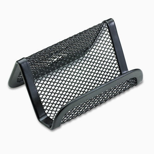
I also have struggled (and this is going to sound crazy) on where to put my cell phone during the day. I normally don't do a lot on my cell during the work day, BUT it is the main contact number that my children's school and care takers have, so I need to have it close by just in case. Also, our delivery drivers text me with questions, so that's another reason it needs to be out and accessible.  And it hit me- a business card holder for the desk is the PERFECT solution for a cell phone holder! Sure, we cell lots of desk organizers that have this feature, but most of them are larger than I needed or wanted. I wanted a small something to just set the phone in. So I got this:

ITEM NUMBER: ROL 22251ELD (pg 787 in new catalog)


And it's been perfect! Great multi-tasking item, Rolodex!

I also needed a good place for everyday necessitites-- paper clips, pens, post-its, etc. Before I had a very bulky desk organizer (you can see it just to the right of my monitor in the before picture) that didn't work great. But I decided to try this:

ITEM NUMBER: ROL 1746466 (pg 786 in new catalog)


What I love about this: it holds all I need and still makes it completely accessible! The one I had before was all closed in and not functional at all. This one has open sections for paper clips and what not, and a drawer that is perfect for the post-it notes I use daily. It's great and still stylish (very important! ha!)

Now I feel organized and in control of my desk, thanks to very small changes I made. I've said it once I'll say it again-- use that vertical space! It makes things so much better!!

Here is an after picture:


See what I mean?? Tons more room!

Wednesday, February 5, 2014

How to know you're ready for a new office chair

Let's start this off by trying to put the decision into perspective: Would you spend only $60 on a new mattress?  A mattress that you sleep on every night.  A mattress that could lead to back pain with poor springs and little cushioning?  Probably not.  So why is your office chair looked at any differently?  And I know from talking to you that for some, more hours in our office chairs than we do in bed!

There are many options that can benefit your back and legs.  You may think you are saving when you buy an inexpensive chair, but 99 times out of 100 you end up paying with either poor quality or back pain. With our extra discounts on HON this month, now is a great time to consider a small investment in yourself.

Most of us spend about a third of our day sitting at our desk. The right chair can make a huge difference in your productivity, comfort and health. Are you ready for a new one? You probably are if...

- Your shoulders and neck are stiff and sore
- You have to stretch to reach your mouse or keyboard
- Your lower back aches
- The seat cushion provides little or no padding
- Your chair does not slide under your desk
- You have eyestrain
- Your chair is too narrow, long or short in the seat
- You're just plain uncomfortable!


Whether you sit at your desk for hours at a time or in spurts throughout the day, it is crucial to select a chair that supports your shoulders, arms and back. Having an ergonomic chair that offers support prevents you from hunching over or overstretching which can lead to chronic muscular problems. Ergonomic chairs allow you to make several adjustments to the height, back, arms and lumbar region. This is not a one size fits all, and there are many options from which to choose.

Here are a few tips on selecting an ergonomic chair that works for you.

Consider how you work. Do you spend a lot of time on the phone? Do you need to quickly access files or other items in desk drawers? Do you use the keyboard and remain in the same position most of the day?

Height: You should be able to sit comfortably, feet flat on the floor with your knees at a 90 degree angle. Look for a seat with a pneumatic lever you can raise or lower while seated.
Arms: Armrests take the pressure off your shoulders and neck which is especially important if you sit at the computer for a significant part of the day. When typing, your forearms should be just above the armrest, with your elbows resting on it. Look for armrests that adjust for both height and position to accommodate different activities.
Back: We all have a natural curve in the lower part of our spine, and it?s this area, the lumbar region, that can cause the most problems if not properly supported. That?s why a good ergonomic chair should include a lumbar support with adjustments for up and down, forwards and backwards to suit the natural angle of your spine. It should be high enough to support your shoulder and neck, while allowing for movement so you can reach for items when you need them. Spend a lot of time on the phone? Then you may want to check out chair backs that recline to suit your posture.
Seat width and depth: Look for a chair that gives enough depth in the seat so you have two to four inches between the back of your knees and the edge of the seat. The width should be at least one inch wider than your hips and thighs.
Headrests and footrests: These features aren't for everyone, but may be right for you. Headrests provide good support and prevent neck pain when talking on the phone in a more reclined position. If you want a footrest, select a free-standing one that allows you to rest your feet, keeping your knees at a 90 degree angle.

With literally thousands of chairs available to you, let our staff help in picking the right chair.  We can find you something that is both comfortable and stylish, and make your workday a little more enjoyable.

Portions reprinted care of biggestbook.com

Tuesday, February 4, 2014

Project Organization: Amanda's Office Area Re-Organization, Part 3

I don't know about you, but I watch a LOT of HGTV and DIY network. And one thing I have learned (among the many) is to use your vertical space. And when you have a small office space or desk area, that can make you or break you. It can give you SO much more room on your desk to work and spread out, and depending on what you're doing, that's a big deal!

I have always had a bulletin board hanging over my desk. However, it's basically been a landing space for a lot of personal items like my little boys' art work, pictures of said little boys, phone numbers I needed to remember, post-it notes with passwords on it for me to remember, etc. You know, important stuff! And honestly, this is probably the one area of my desk that prompted me to re-do my whole area- it was bad. A cluttered mess that was unprofessional and not fun to look at. So I set out yet again in our catalog to find a good solution.

Here is my before picture:


It's OK. You can say it. YIKES. It was bad! Pretty much the only thing I loved looking at in this area of my desk were the little faces smiling back at me. Definitely not the area or board! A big part of the problem was the busy pattern in the bulletin board. I love Vera Bradley as much as the next girl, but a sleek more professional look was in order. And I decided I had too many picture of my kiddos up and the post-its were out of control. All the information needed to be consolidated! So I started with finding the perfect board, and here is what I found:

ITEM NUMBER: BVC-SF0722581012 (pg. 382 of new catalog)


It was nice looking (warmer than what I had before), larger than the board I had before, and professional looking. Check, check, and check. So I took down everything and started from scratch. I consolidated all my notes that were on post-its and made a master list to hang on the bulletin board so that they were always in my line of vision (and got rid of all the colorful, seizure inducing notes) and cleaned it all up! Here it is in all it's glory:

See, I didn't get rid of ALL the pictures of my kids :) Just don't have as many. And I think it looks good.

I also want to share another product I used in this part of the re-organization. They are the display pockets that you see my lists in:

ITEM NUMBER: MMM WL854C (pg. 1450 in new catalog)


Melissa and I both are a little obsessed with these pockets. They are made my 3M and are 8.5x11" (so fit a standard piece of paper, or 8x10 photo) and are stiff; so much better than your normal sheet protector.  Here are the specs: Display Pocket.

I also splurged and got aluminum push-pins because lets face it- they look better than the standard push-pin! :)

ITEM NUMBER: GEM CPAL3 (pg. 379 in new catalog)


So that's my vertical space. I am sure I will add more to it, but for now I'm happy with how clean and "empty" it is! Do you have vertical space you're not utilizing to it's fullest? Try it! I promise you won't be disappointed! We have a ton of products you can use for this exact purpose that you can use in an office or a cubicle!

Tuesday, January 28, 2014

Project Organization: Amanda's Office Area Re-Organization, Part 2

I have a lot of "apparatuses" on my desk that take up a lot of room. A LOT of room. In fact, a big problem for me was that these apparatuses took up so much room, I didn't have a lot of work space! Something needed to be done, for sure. I will talk more about this in later posts, but vertical space is a beautiful thing. After dealing with this mess for a long time:


It was time for another layer of space. I needed a shelf, I determined, to hold some of said apparatuses. So my search started. I don't have a huge desk, so I needed something compact but that would be functional- not just add to my cluster I already had going. I found this in our catalog:

ITEM NUMBER: SAF 3604BL (pg 789 in new catalog)


I thought this could be a good solution- it was only 7" deep, so not obtrusive, had storage on each end for me to utilize, and had good shelf space for me to use. I decided to give it a try and I'm so glad I did! The scanner you see in my "before" picture was able to slide under the shelf, I have a check scanner for making bank deposits that sits on my desk that was able to go on top of the shelf, and my lamp also went on the shelf! It has not only given me more room, but visually it looks like I have more room, which is great. Here is the after picture:


Much better, right?! And I even have room to the right of it for my phone to sit. Which was always in my way before. This has been a great fix! And the storage on both ends has been great- things I need at my finger tips but that needed a home! Love it!

Tuesday, January 21, 2014

Project Organization: Amanda's Office Area Re-Organization Part 1

I love neat, organized spaces. Who doesn't!? But getting a space organized and KEEPING it that way are two totally different animals. Anyone can organize something and make it look good. But when it comes to your desk and office space, you want it to STAY that way so that it's functional and flows better.

I have worked at Tierney for twelve years. I have basically had the same desk accessories and organizational techniques that long, too. And one day I took a look at my space and it gave me hives. It was cluttered, tacky, and never STAYED organized no matter how many times I dug in to fix that problem. So I created a new mission for myself: to create an organized, FUNCTIONAL space that would stay that way! And look good while I did it :)

So, I have decided a blog series is in order. Each week I will highlight a section of my desk that I re-organized, share the products I used, and what works about the new system that didn't about the old.

My first project was to organize the corner of my desk that I use a LOT. It houses all our customer invoices, my catalog, pending purchase orders, custom orders, and important information I need to keep track of. It also (not purposely) severed as an In-Out box that I didn't like. So I needed to fix that. Here is a before picture:

Not horrible, I know. It just didn't function like I wanted. And LOTS of paper work would make it's way in there that didn't need to be there.

So I perused our catalog in search of a better option. And I came across this:
It has several different landscapes it can be used in, which makes it super versatile, it's not huge (a big criteria of mine, as the "before" picture shows my last file holder was huge and not meant for corners) and sits nicely in a corner. It is also meant to hold file folders, so the walls of it are higher than my "before", as you can see didn't hold file folders well. So this was it! Also, I saw that I could use it in a landscape that didn't allow for an in-out box :) That made me happy. (Don't you hate when there is an area that EVERYONE thinks is OK to just throw stuff on your desk? And it  gets buried under everything? Yea, this was the place on my desk where everyone put everything.)

And this is where I ended up:

ITEM NUMBER: ROL 1742322 (pg 785 of new catalog)


What I love about it: Everything has a spot. I think this is vital in any good organization plan, and certainly helps things STAY neat. The tall walls of the file folder sections are great so that nothing flops around and bends down, as did my "before" picture.  I even have a little place for my stapler! I love how clean and streamline this has made this area on my desk! I know it seems small, but it is a high-use area on my desk!

Hope you liked the first installment of Project Re-Organize Amanda's office! Stay tuned next week for bulletin board organization! Spoiler alert- this one was a MAJOR eye sore in my office! :)


Saturday, January 18, 2014

Calendars have a finite shelf life


News, right? That's the kind of hard hitting information that I hope we provide you at Tierney. 

Jokes aside, there is a reason I bring this up.  By now, the majority of you have purchased your calendars, appointment books, miscellaneous dated good for 2014.  And that's good, because many if not most of them are going to be sold out any day now.  You see, the calendar manufacturers don't want extra product sitting around any more than you or I.  A set number of every SKU is created and distributed each year.  Basically enough to last through January based on the anticipated need.  The science behind determining that number isn't perfect of course so sometimes it lasts into February or March.  Sometimes a product is sold out the last week of December.  The exception to that rule is usually the most common of dated goods -- plain #17 calendar refills, plain wall calendars, etc.  Supply on these lasts into mid-Spring.  The point is, if you are still needing to order dated material for 2014, do it sooner than later.  If not, you may have to look up from your desk at a plain calendar instead of kittens in picnic baskets.